I have recently developed an obsession with paint. Those unloved magnolia walls you can’t bear to look at – wouldn’t they look much better with a coat of Elephant’s Breath or a wash of Skimming Stone? It must have been around two years ago that I discovered the charms of Farrow & Ball paint, and if I’ve learnt anything over the course of decorating my home, it’s that there’s no room – no matter how small or pokey – that good paint can’t salvage.
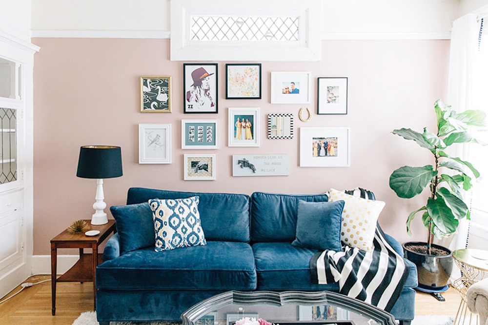
Choosing colour combinations isn’t exactly my forte. In fact, embracing colour full stop is something I struggle to grapple with. Enter my wardrobe and you’ll find a sea of black, grey and, well navy for those days I’m feeling adventurous, and my approach to home décor follows a similar vein. Covering my house with variations of neutrals, I can do. Fusing splashes of colour for maximum effect, not so much. For the most part, seasonal colours have gone the way of fashion trends in my mind – left behind and their existence ignored. However, the basic wisdom isn’t lost on me: some colours look bad and garish together while others don’t. It’s all about the pairing.
Long story short, this quest to break out of my comfort zone and embrace something new led me to Charlotte Cosby, creative director at Farrow & Ball. Long time readers will know that we’re big fans of the brand but that aside, Charlotte really is your go-to woman for all things paint and interiors. Each season she has the unique duty of working through some of history’s most beautiful colours and repurposing them for today. Compared with the thousands of options you’ll find at other paint companies, Charlotte and her team have edited the options down to 132 colours both traditional and contemporary, so she’s basically done all of the hard work for us.
Paint isn’t cheap and there’s no question about it, Farrow & Ball is on the upper end of the price scale, so finding a colour combination and committing to it isn’t easy. As someone who routinely takes about 30 minutes to choose a nail colour, don’t worry, I feel you. So to make sure you don’t make a wrong turn on the colour wheel, we asked Charlotte to outline all there is to know about creating a colour vision for your home. You’re welcome…
On the most popular colour combinations: Layering colours from our six neutral families is a perennially popular colour combination for our customers. By using subtly different whites, off-whites and greys from the same family like Cornforth White, Purbeck Stone and Ammonite you can create really flexible spaces in the home, with light and flow throughout. This simple idea of laying one tone upon another is easy to achieve, and creates a hushed, soothing environment.
 We’re also increasingly seeing darker colours used as the ‘new neutral’ in a space. Evocative shades like Railings, Black Blue and Pitch Black are becoming popular wall colours, creating drama and intrigue. These rich tones are the perfect backdrop for pops of graphic orange, yellow and turquoise that are so popular at the moment. Alternatively, if you want to create a really multi-layered dark look then pairing darks with darks is another option. Blacks like Off-Black and Black Blue on walls with Stiffkey Blue or Hague Blue on woodwork will have a very modern feel.
On what to consider before choosing your colour scheme: Choosing colour combinations for your home is a very personal decision but there are a number of factors you should think about before deciding upon a particular scheme. A good place to start is by thinking about how light moves through your home and the effect it has at different times of the day. Light plays a very important part when it comes to colour schemes. For example, if you have a north facing room, choosing a cool shade may make the room feel cold, so choose warmer tones like Joa’s White or Brinjal. Also consider the period of your property and whether this might influence your choice. Choosing traditional colours will complement the property’s heritage. Alternatively, for a completely fresh look, contemporary colours can create a sense of drama in traditional surroundings. If the room has lots of architectural features, don’t be tempted to use too much colour, as this will detract from the very thing you are trying to enhance.
Think about the colours you are comfortable with – look at your clothes, your car, furniture and fabrics. Decide on a palette that feels right to you.
Always use Farrow & Ball sample pots to choose colours. Paint about one square metre onto lining paper and position the painted paper around the room at different times of the day to see how the colour reacts to different lighting conditions and furnishings. Look at your possible options vertically, rather than laying them on a table.
On things you should actively avoid when creating a colour scheme: We don’t believe in hard and fast rules when it comes to colour combinations, but one of the biggest mistakes people make when decorating with neutrals is choosing a white or off-white which doesn’t complement other colours used in a room. It’s important to choose a white with the same undertones as the wall colour. For example, if your room has a feature wall painted in Rectory Red, the white chosen should contain reddish hues that sit in harmony with the stronger colour; try Joa’s White for a really warm interior. Conversely, if you paired Rectory Red with James White, the green tones within the white would jar with this warm red tone.
On the biggest colour trends of the moment: We’re witnessing a real need for people to create spaces that offer escapism and a place to relax and reflect. There is an instinctive return to paler colours, which lift the spirits and create interiors that live and breathe. Our four key colours right now – Pink Ground, Light Blue, Breakfast Room Green and Tanner’s Brown – all promote relaxation and reflection in interiors.
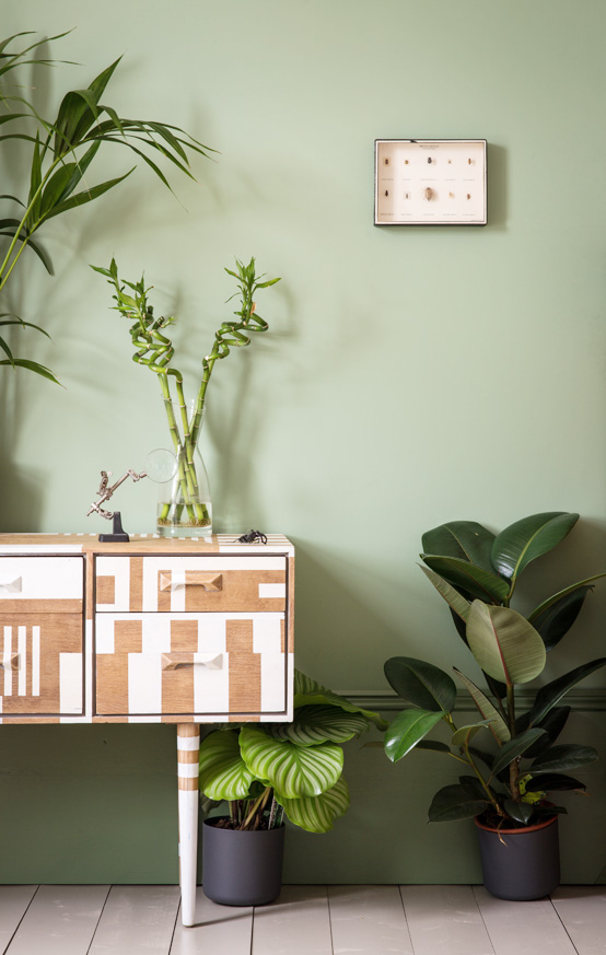
Breakfast Room Green can be used to create a fresh room when paired with complementary James White on the ceiling. It’s best contrasted with stronger Calke Green on the woodwork to recreate the colours derived from the irregular staining and tinting found in plants and vegetables. Complete this leafy look with Light Gray as an accent colour in the back of shelves, on the floor, or as random stripes on the wall to create a really exciting, fashionable interior. This trend reflects a shift away from hard, graphic interiors to a softer more natural feel with a modern twist.
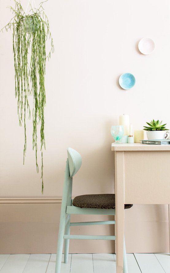
Use Pink Ground with a slightly stronger colour on the woodwork, like Setting Plaster, to create a lighter room. Because the tones are close, the feel is almost of camouflaged beauty with no strong contrasts or hard lines. Similarly, accent colours should stay cloudy and soft. Pale Powder sits perfectly alongside Pink Ground; use it on either furniture for a more relaxed feel, or on the floor to complement the whimsical pastel palette on the walls and woodwork.
To create an almost transparent interior, contrast Light Blue’s silvery, smoky qualities with the unexpectedly cool grey Dimpse, a colour inspired by the tones of twilight. Create a feeling of relaxed movement by adding an accent of Lamp Room Gray on the floor, feature wall or furniture, and Blackened on the ceiling.
On unexpected combinations that work: Combining unexpected colours like Charlotte’s Locks, Blue Ground and Rectory Red can be used to add a sense of fun to a space. They are particularly effective when used in smaller rooms; a cheery colour in a small bathroom or cloakroom is a great way to add surprise and make an otherwise forgotten room more memorable.
Choosing colours with the same tonal weight can help create flow through your home, and is a great way to create unusual, but successful colour schemes. For example, pairing Book Room Red and Octagon Yellow creates a feeling of continuity as the colours have the same weight.
We’re also seeing a trend to use bright colours in high shine Full Gloss on walls. This will create a particularly striking scheme when combined with our chalky Estate Emulsion, adding a subtle layer of interest to the space.